sweet polka

living art

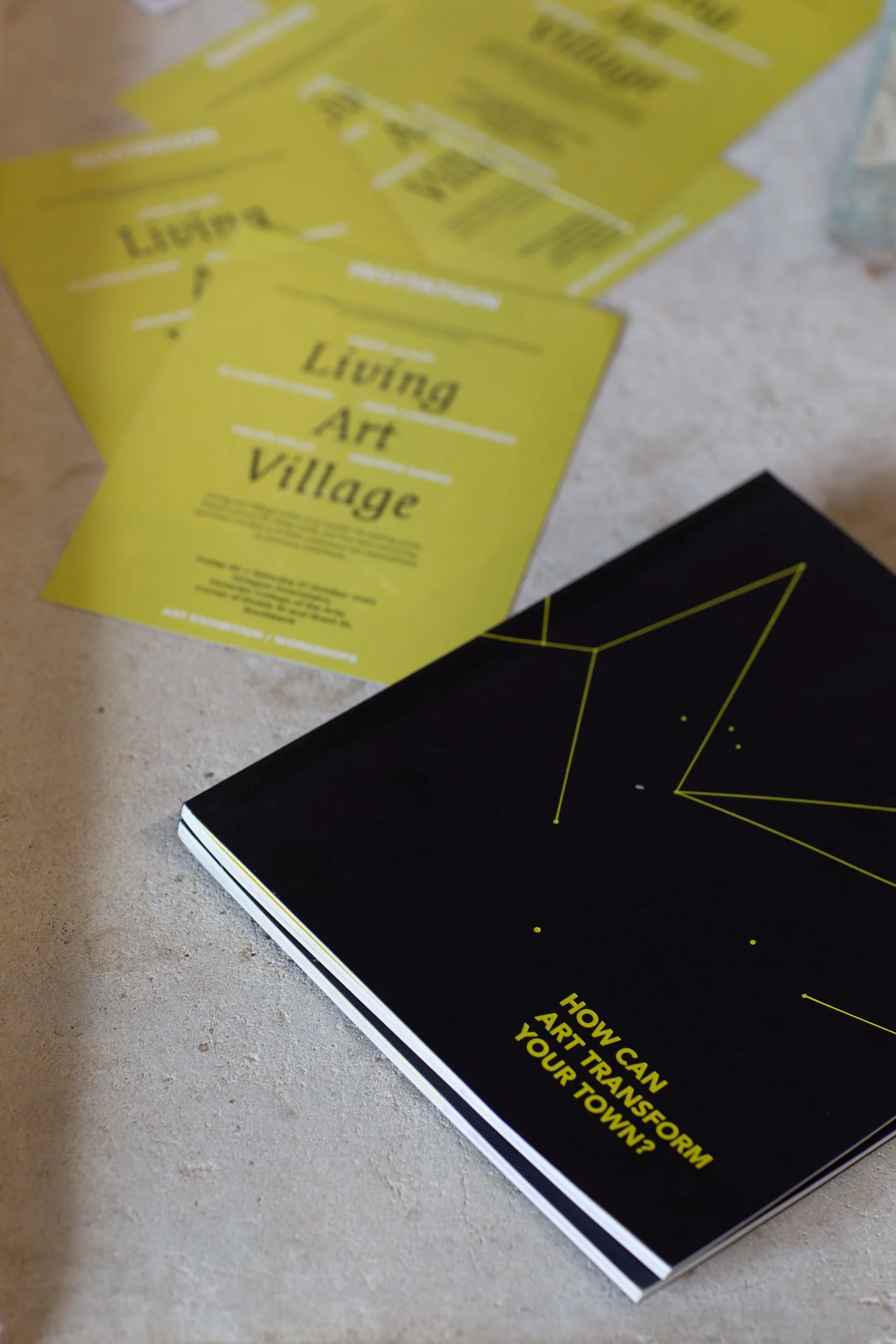
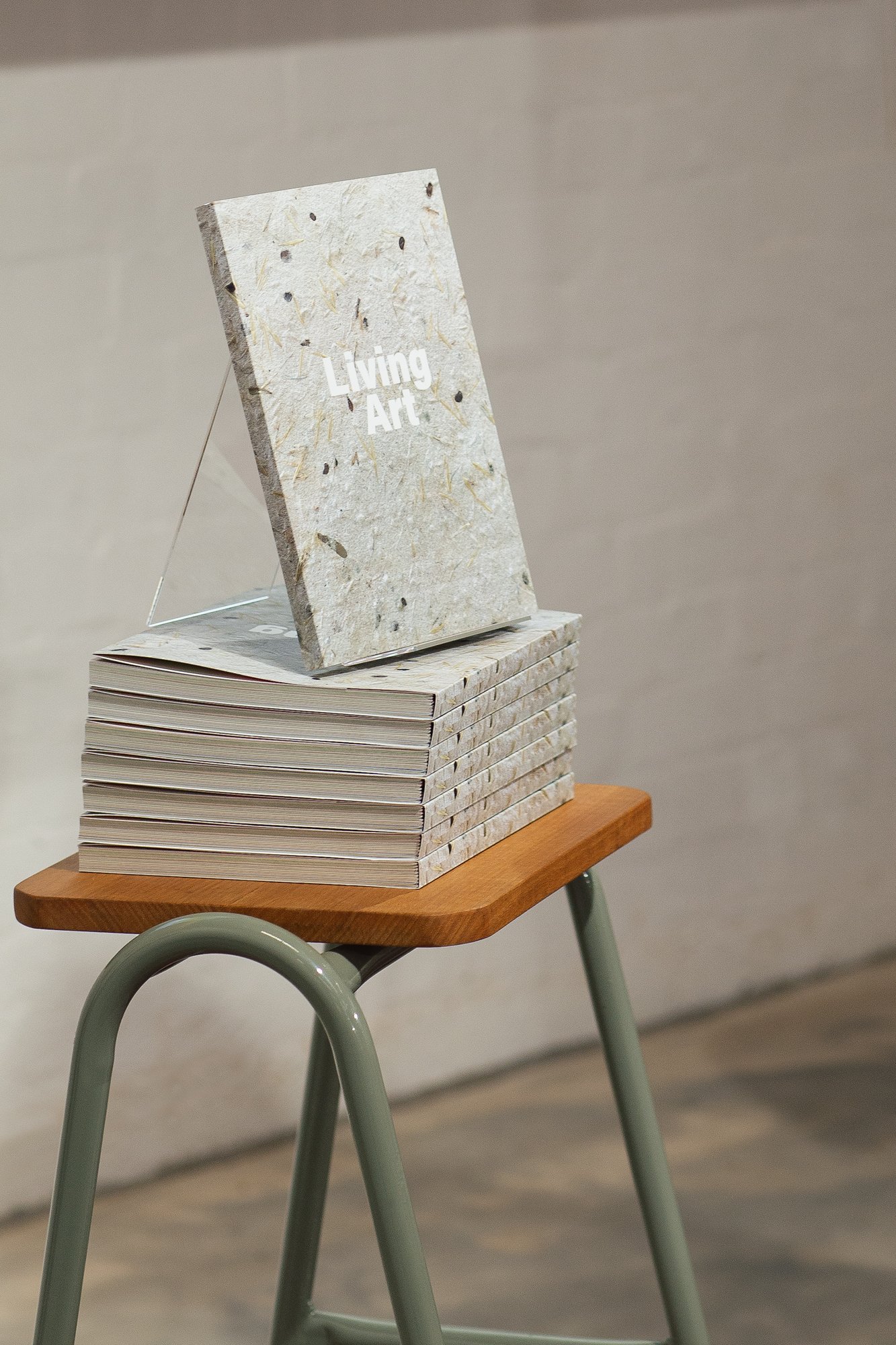
Capturing the launch of the LIVING ART publication and accompanying workshops was both a privilege and a pleasure. The catalogue publication was exquisitely designed by Anna Zagala and edited by Dr Suzie Fraser from COVA at University of Melbourne. It documents and explores the need for creative-led, common spaces to strengthen community resilience using the community of Dookie in regional Victoria as the model.

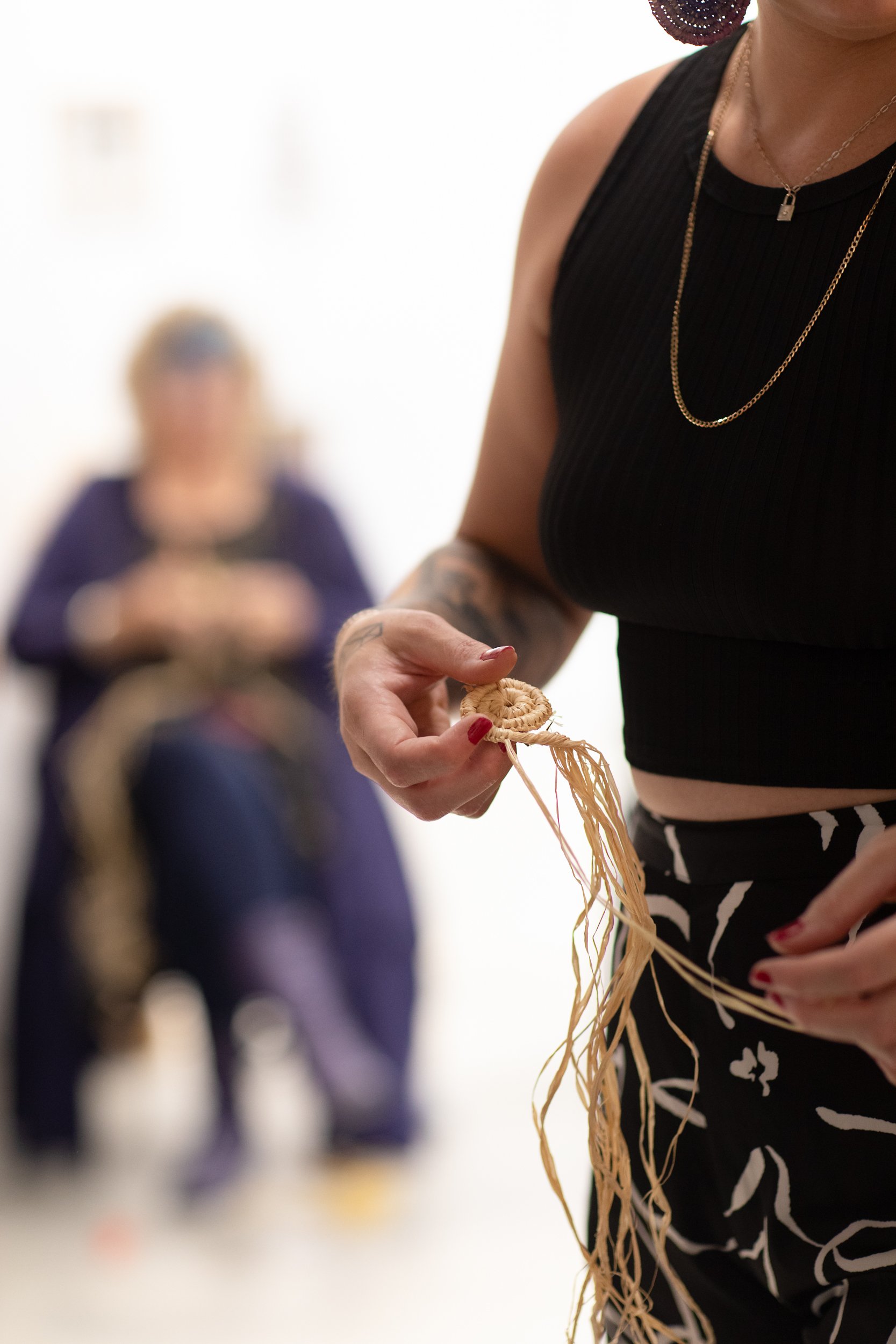
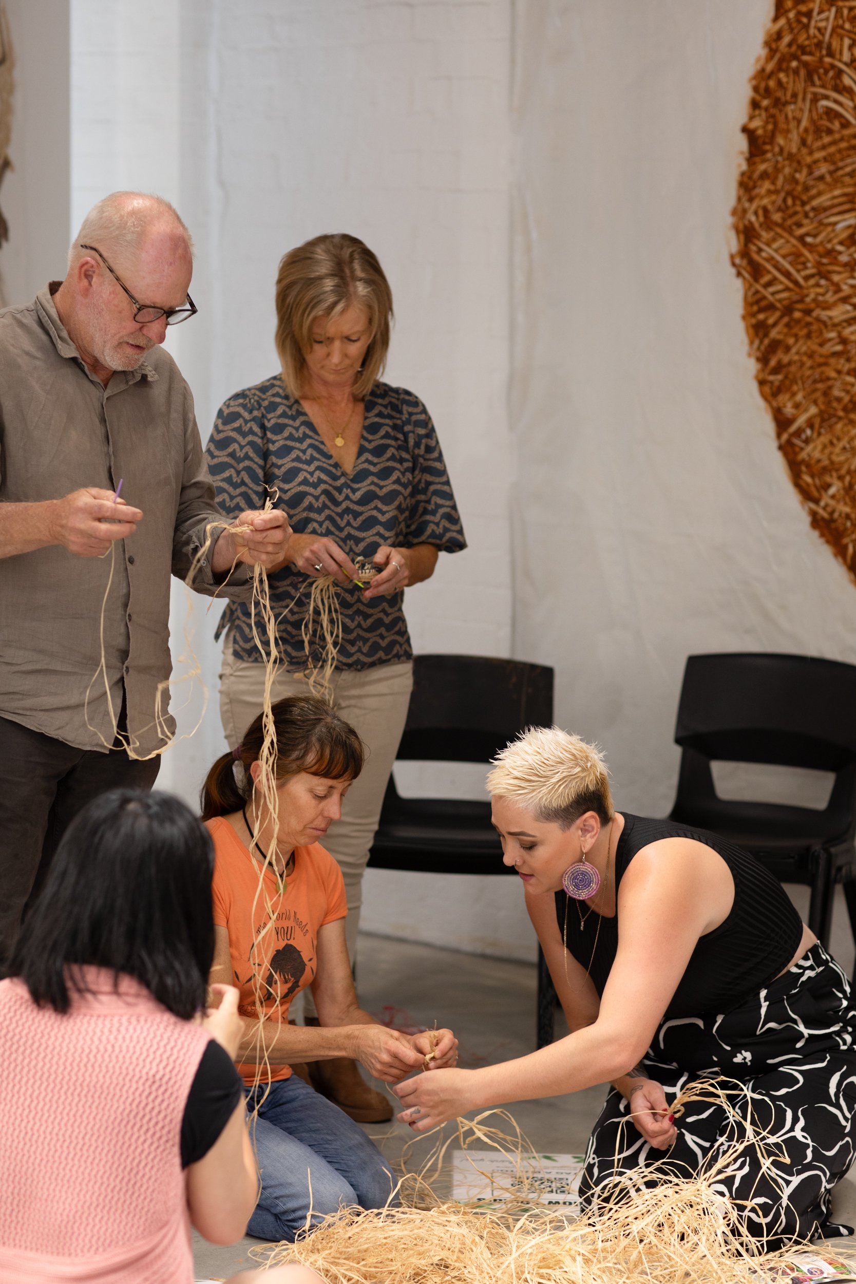
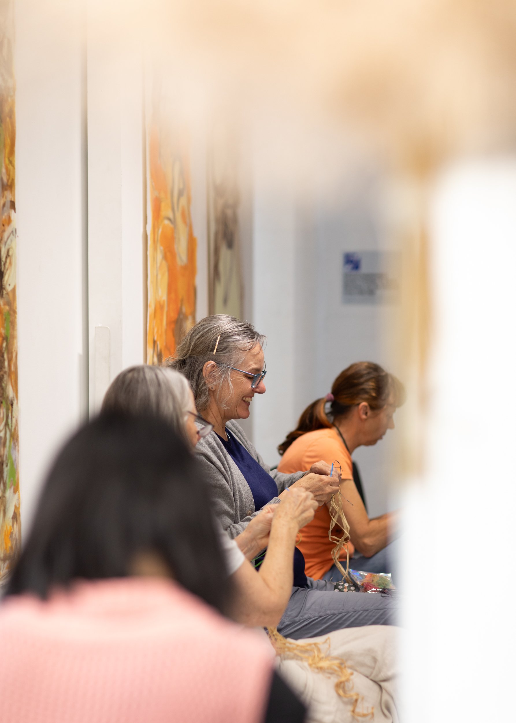
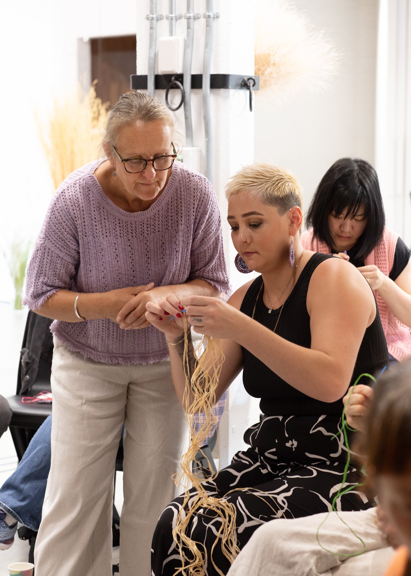
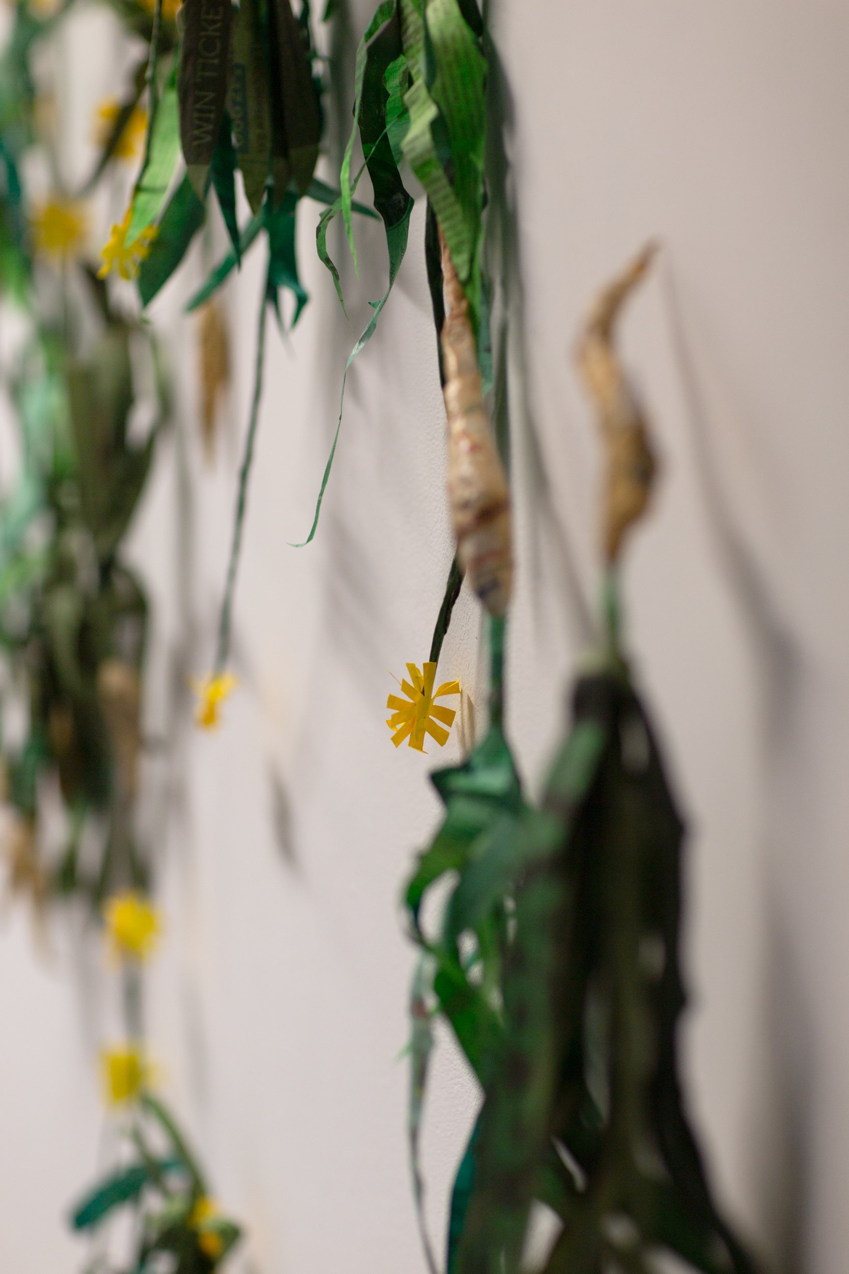
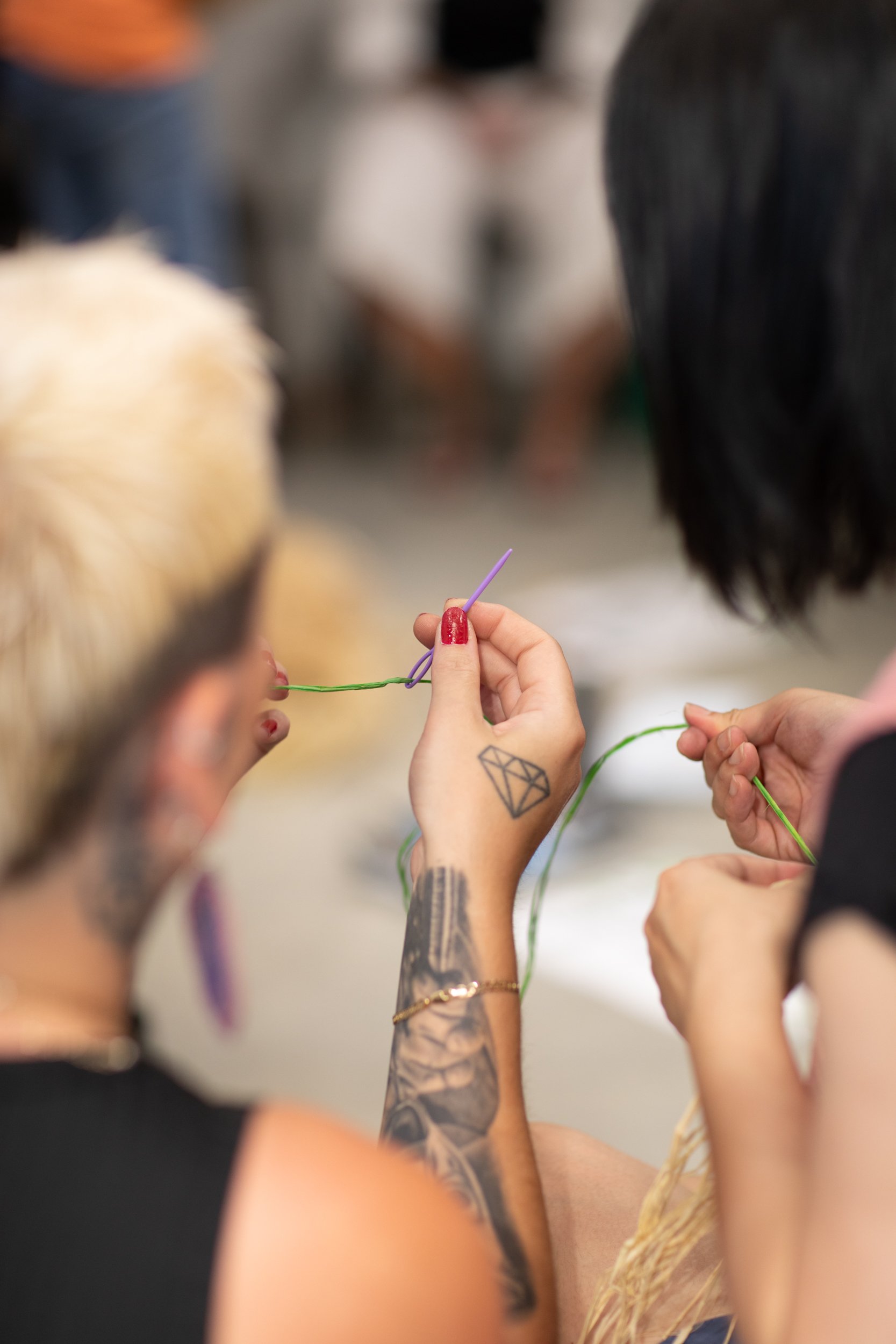
I hovered around capturing glimpses and moments of the workshops that drew on the expertise of the project’s various participants. The workshops encompassed knowledge of seed banks, native foods and grasses, place-specific geology and Indigenous perspectives on caring for Country.

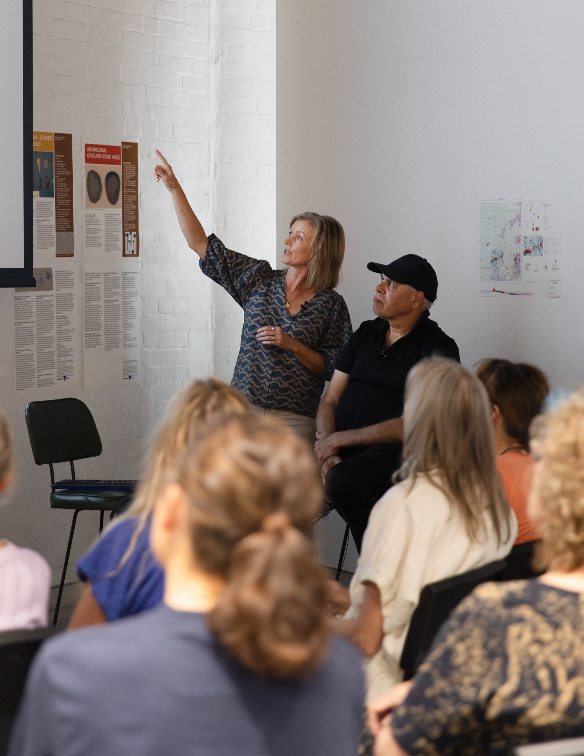
An expansive conversation between Yorta Yorta man Neville Atkinson and Dookie archaeologist Gaye Sutherland was very moving - having worked side-by-side for decades they shared their knowledge and experience of place, the ancient rocks and prized greenstone.

time for a brand refresh?

An image from the new series for Anna at Sweet Polka. As a graphic designer and visual communicator, Anna is keenly aware of the power of effective imagery to win and influence her clients. She knew she did not need a rebrand (a total overhaul of th…

An image from the new series for Anna at Sweet Polka. As a graphic designer and visual communicator, Anna is keenly aware of the power of effective imagery to win and influence her clients. She knew she did not need a rebrand (a total overhaul of the brand from the ground up) to inject a renewed sense of vigour. All she required was a fun afternoon spent crafting a handful of fresh images for use on her website. Photograph by Emma Byrnes.

Is your brand feeling a little stale?
Does it feel like the ethos and principles of your brand are still relevant but the execution isn’t as elegant and effective as it could be?
If your answer is YES but the idea of a refresh fills you with a deep-seated fear of the endless hours you will lose as you go deep and attempt to reinvent the wheel (or in this case, your brand) - there is absolutely no need to fret.
Rather than going way out onto the precipice of rebranding, you can maintain the philosophy and essence of your brand but transform it into a super-charged version of itself by taking a few simple steps.

A portrait of Anna of Sweet Polka. By using a restrained colour palette and a beautiful inner city location we were able to photograph a cohesive set of images - each one powerful in it's own right but able to sit within a visual framework. Photogra…

A portrait of Anna of Sweet Polka. By using a restrained colour palette and a beautiful inner city location we were able to photograph a cohesive set of images - each one powerful in it's own right but able to sit within a visual framework. Photograph by Emma Byrnes.

To start off, in most cases (with just a few tweaks from one of Heartland Project’s gun copywriter collaborators), your existing content can continue to serve your brand well.
The next step and in my opinion, the key secret ingredient to your brand refresh, is in creating a suite of professional, compelling and enticing photographs that reinforce your brand's central messages in a way that makes sense to your target audience. If you have been leaning too heavily on tired, daggy old imagery it is definitely time to (re)capture the attention of your clients with some original high quality snaps.
Having your own suite of professional photographs that you create from scratch allows you to shape an authentic and precise visual message, giving you control over what you evoke in your viewer. You can showcase real products, real services and real people from your team rather than the poor substitute of “off the shelf” stock photography. 
A limited series of original, high quality hero images are a key element - the right ones establish trust and catch the positive attention of viewers right away, adding to effective brand design.
In addition a wider gallery of associated images allows you to showcase your services/products on your website and can also be used for further promotion both on social and print media.

A close up detail of the Tea and Sympathy website for Sweet Polka as part of the brand refresh. Photograph by Emma Byrnes.

A close up detail of the Tea and Sympathy website for Sweet Polka as part of the brand refresh. Photograph by Emma Byrnes.

Recognising the importance of visual storytelling is key to your brand’s success. 
I'm not just talking about pretty pictures, I'm talking about a way to visualise information in a simple way that makes sense to your clients. 
If you are tempted to skimp on professional photography bear in mind that images go into our long term memory and heavily influence a visitor’s opinion of your company culture. Potential clients will often eliminate your brand from consideration immediately, based on poor photography. You want the right photos, shot in the right way, by the right person: an experienced pro who knows how to get the most from a photograph. Your photos must be flawless. 
Get in touch to talk about the imaging opportunities that exist for your brand. Nothing gets me more excited than the opportunity to uncover a brand's true potential through successful visual storytelling :-)

Em x

tea & sympathy

A banner image from the new Tea & Sympathy website. Photograph by Emma Byrnes.

A banner image from the new Tea & Sympathy website. Photograph by Emma Byrnes.

Earlier this year Anna from Sweet Polka approached me to work alongside her on the online rebranding of local tea artisan Tea & Sympathy. Anna would be responsible for the overall art direction of the project plus the word-smithing and I would generate the photographic imagery, design the look-and-feel of the new website and then rebuild the whole thing in Shopify.
Tea & Sympathy stocks a limited, hand-picked range of premium leaf teas - from classic blends, to many interesting bespoke Chinese and Taiwanese teas not otherwise available in Australia. Angelina Yannuccelli who founded the brand sees the range as an extension of her own personal tea odyssey and immersion in tea culture.
I first met Angelina when she established the brand back in 2012 so I was aware of the knowledge and passion she applies to her business and the calibre of the range she offers. When I visited her old web site I realised that it did not reflect the authority and perspective that she had garnered over the past five years in the tea business. The site was full of great information but it was cluttered and disparate, having been added to in a piecemeal way over time.

A banner image from the new Tea & Sympathy website. Photograph by Emma Byrnes.

A banner image from the new Tea & Sympathy website. Photograph by Emma Byrnes.

 We decided to simplify the user experience and elevate the imagery to a standard that matched the quality of the tea for sale. Anna and I spent an afternoon photographing images to create a general mood for the brand - we wanted the feeling to be tangible yet sophisticated to reinforce the brand's authority on teas whilst reflecting the personal touch that Angelina brings.
We would also streamline the way the individual product was presented by photographing the teas in ceramic bowls provided by local homewares wholesalers - Marmoset Found. I must say this was a very pleasurable experience - spending the day with Angelina and her encyclopaedic knowledge of her range, visually honing in on each tea as a separate entity and observing the colours, textures and smells. 

Chrysanthemum flower tea in beautiful ceramic bowls by Marmoset Found. Photograph by Emma Byrnes.

Chrysanthemum flower tea in beautiful ceramic bowls by Marmoset Found. Photograph by Emma Byrnes.

Once the imagery was finished I built the site and Anna edited the copy. And, as of last week, it is out in the world ready for the next stage of the brand's growth.
I wish Angelina all the best with Tea & Sympathy. Having worked with her I understand that the motivation behind her brand comes from a passion for excellent product and supporting artisan growers and small family farms in tea-making traditions that have been passed down over the centuries. Wonderful!

Em x

sweet polka

Anna from Sweet Polka. Photo by Emma Byrnes

Anna from Sweet Polka. Photo by Emma Byrnes

Photographing the folio pieces of Anna from Sweet Polka yesterday was delightful.

Anna's work is minimal and often has an almost child-like quality to it - pared-back, hand-touched, hand-carved, slow, from the heart. Neither overworked nor dominating.
Without any effort at all we identified the visual language for her work and then spent the day letting the story be told in a contemporary yet not overly-styled manner.
Now that we have a bank of images I am looking forward to working with Anna over the coming months on launching a new website and then hatching an exciting textiles project together later in the year. 

As well as a talent for design Anna is an excellent writer and has written a blog post about our day together.